
Marketing creators are fun to watch. Their website reviews and advertising hot takes are informative. I’m deep in the marketing game too. I see everything in the world like a ticker tape of selling. It’s hard not to have my own opinion.
I recently compared two brands. I highlighted the difference between good and bad copy.
🚩Too much text
🚩Too much ego (i.e. lots of “We” statements)
🚩Too much insider talk (i.e. jargon and complex words)
These red flags are noise. And, noise pushes customers away from your brand and into the arms of another lover. The two brands I looked at were Beehiiv and Ghost. Today, we’ll look at new examples. When we’re done, I want you to be able to spot messaging that grabs customers.
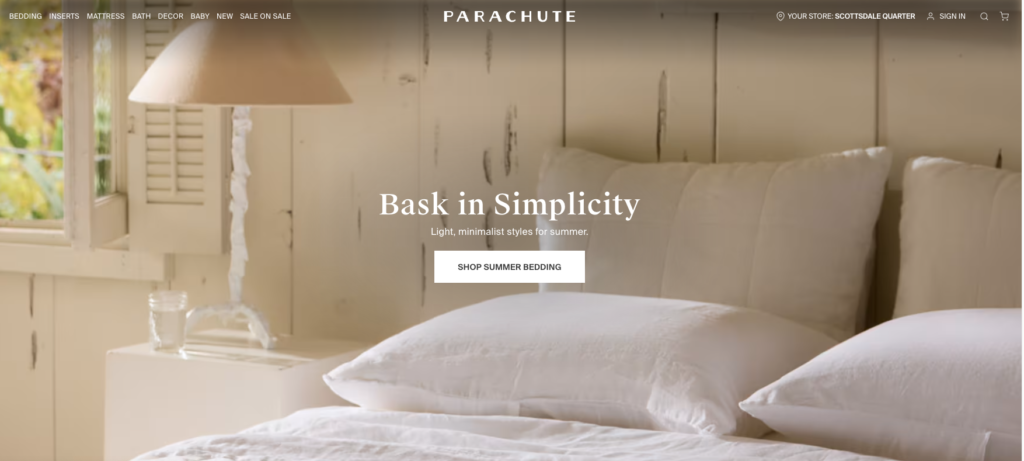
Parachute vs. Brooklinen
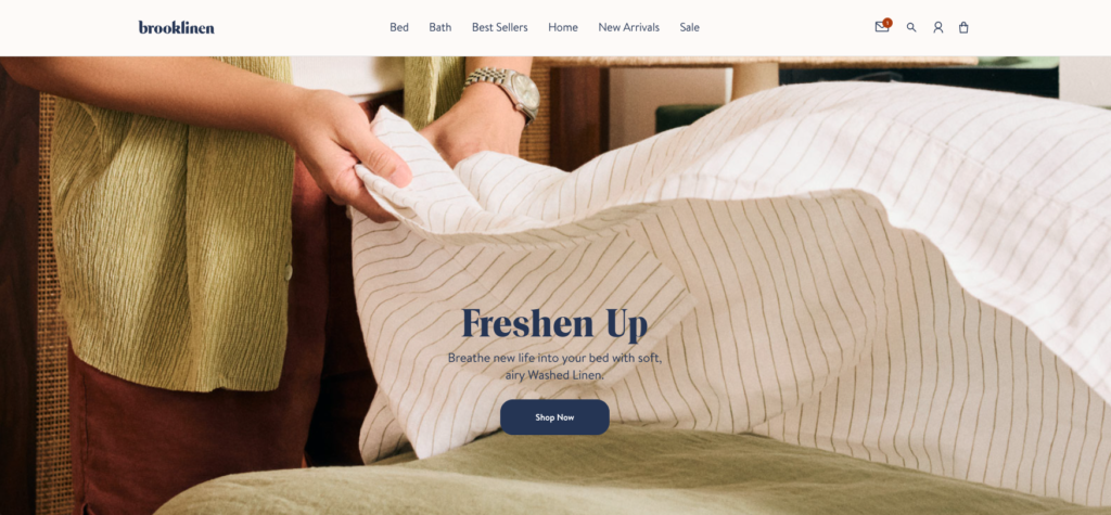
Both brands take a different approach to imagery. Which copy approach do you favor? Brooklinen shines because they show a successful outcome. I can smell fresh laundry and imagine soft sheets against my skin.
Parachute is simply selling me new product. 🚩No story, no engagement.
Take a look at each brand’s about page. There’s a big difference. Can you spot it?
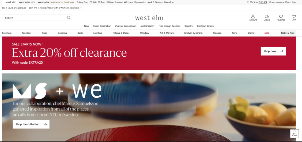
CB2 vs. West Elm
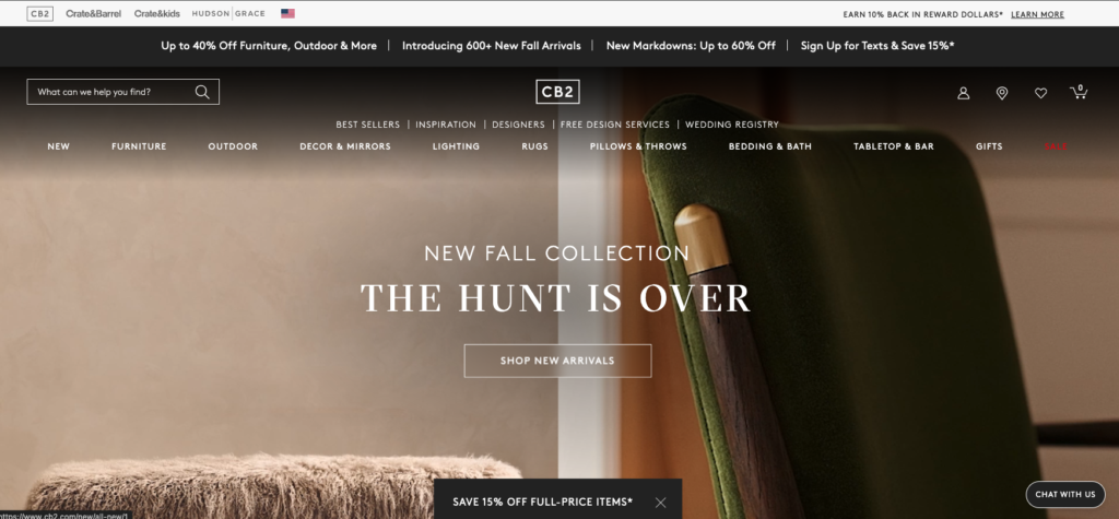
Big e-commerce shops often get formulaic. I don’t think either does a great job helping me feel connected. Yet, CB2 does a masterful job at using visuals to overcome. Their headline copy gives me the sense their curation will blow me away. I don’t need to look any further.
Meanwhile, West Elm is a sh*t show. Below the fold, they do a much better job. It’s a bummer. Let’s ignore the numerous ways to navigate the site. Their collaboration with Marcus Samuelsson is beautiful. But, it makes their partnership the hero—not the customer. You can tell they negotiated every inch of this partnership.
Also, why drop a significant collaboration under the banner of a clearance sign? I’m utterly confused. 🚩Too much mental energy required.
The Ordinary
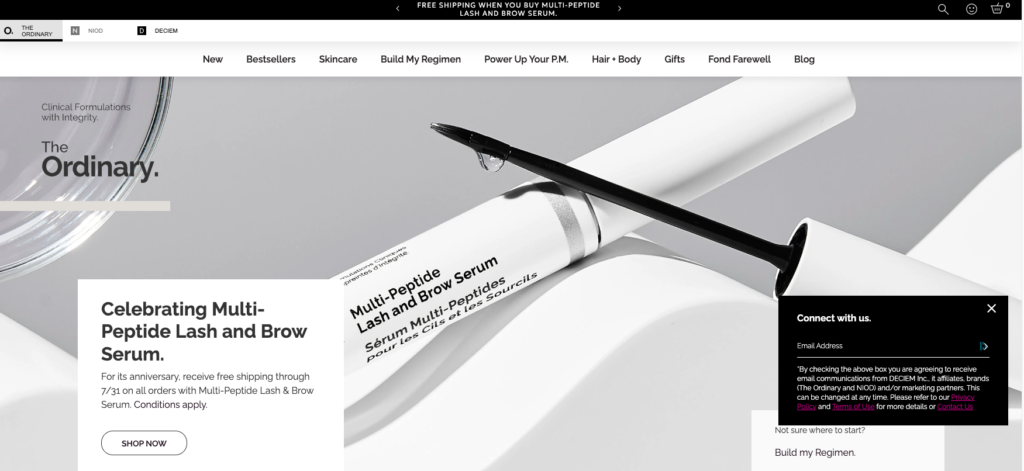
This is the most sterile homepage I’ve seen today. The Ordinary has a chance to show off how their products help their customers revitalize their skin. Instead, the headline makes their product the hero. Companies should try to sell solutions to customer problems. There’s not one reason I need to click “Shop Now.”
“Clinical Formulations with Integrity.” What does that even mean? Who is this copy for, the competition? First impression: The Ordinary has no soul. 🚩Too much insider talk.
Ilia
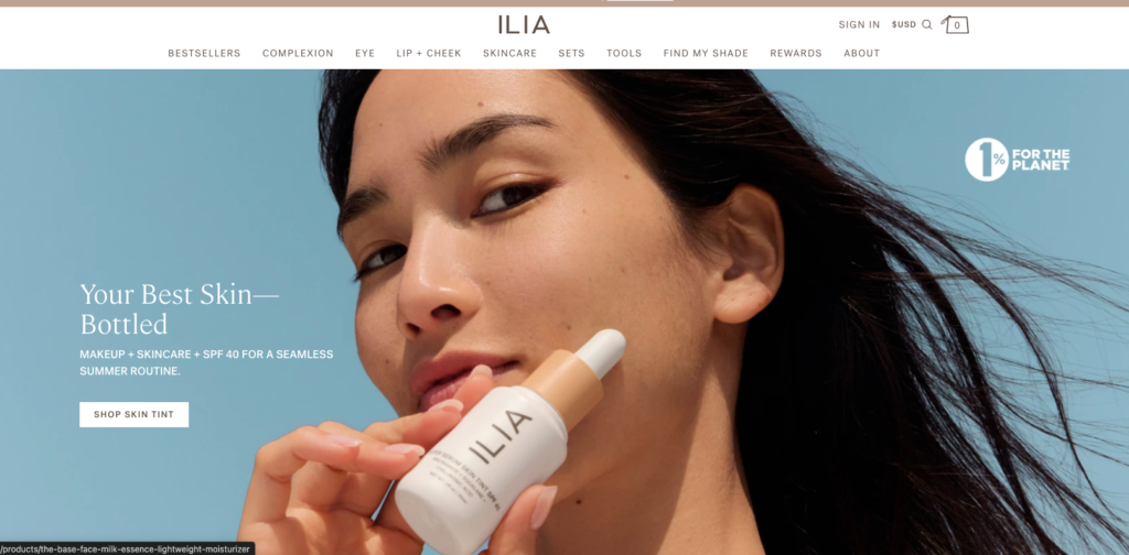
I can see it. The solution to my skin problem is one click away. The model’s skin is amazing but not flawless. This could be me! Bonus: A CTA (call-to-action) that let’s me know I can find product to match my skin tone. The 1% for the planet logo is extra goodwill; a cherry on top.
Key Takeaways
If you want to sell more stuff, you need to engage your customer. I love Donald Miller’s marketing grunt test. Potential customers need answers to 3 questions to engage with our brands. They need that information within five seconds of seeing our website or marketing materials:
- What do you offer?
- How will it make my life better?
- What do I need to do to buy it?
This is only part of the story. But, you’d be surprised how often this isn’t clear. Do you know Sey Coffee? I love their coffee. Their website, confusing. If I had more time, I might order a bag off their site instead of driving to Brooklyn from Harlem. The website is frustrating. I’ll pass for now.
Review these examples. Consider how you present to your customers. Be simple and clear. Cut out the noise.